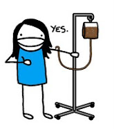
Are you blinded by the bright whiteness of the background?
Boy I am.
Boy I am.
I am trying to make this page reflect ME and I am just not liking the way it looks.
I am struggling.
I am struggling.
These templates and backgrounds and crap are not working together.
Here is my progress or lack there of...
1. I got the text taking up more space like I wanted.
2. Blog name and and picture are centered. Good.
3. I want my pictures to be BIGGER. That's an easy fix.
4. I might just leave the background white but...
5. I want some kind of buttons/tabs/thingies to spruce it up a bit.
6. The text that's chillin' next to my profile picture is driving me CRAZY!! It needs to be completely under the picture.
7. I need a better profile picture than me cheesin' it in our kitchen. Anyone in the Tulsa/Owasso area care to offer their photography skills to taking a nice picture of me? No. I'll bake you a cake! To die for Banana Nut Bread? Dang. Guess I'll whip out my tripod and have a mini photo session with myself...somewhere...secluded....and alone. How pathetic.
But whatever. I found a few things I like that are ME and I am slowly working on them in Photoshop but it's gonna take me a while. Why? Because I hardly know how to use it which is a whole 'nother story I for a later day.
Hopefully I will have it fixed by this weekend.
And I will still be posting even with the ugliness.
Take that!


No comments:
Post a Comment